Saturday, December 18, 2010

Some New Work

Now that the semester is officially over, I'm catching up on some badly neglected photography. Here are a few new pieces.

Infrared


HDR


Wednesday, December 15, 2010

Final Project

My final project was inspired by a sample that I picked up in class. Basically, it was a packet of cards that were about 2" x 3" and each card had information about the company and the services they provide, their location, clients, etc. Since this sample really caught my eye, I decided to go with it. However, instead of advertising for a company, I made mine into a packet that people would receive when they register for the fictitious Oceanside Rock Fest. It would contain the schedule of bands that would be playing, rules and regulations of the festival, directions and a map of the area, and individual cards with photos and information about each band, and a coupon to tear off and present in exchange for a free wristband to get into a particular band's shows.

As mentioned, the target audience would be the people who paid and registered to attend the Rock Fest. The call to action would be for the attendees to utilize the information and coupons contained within the packet.

Were this an actual event, I imagine that I would need to have about 2,000 of these packets printed out, and the price quote I received from Printing Services was $5,074.18 after tax.

The only special requests I had to make before getting this printed was the perforations on the pages that contained coupons, and for a single hole punch through the top center of each page for binding. Otherwise, it was just a basic four-color, two-sided print job. I requested 100lb glossy paper for durability.

The photos are my original work, with the exception of the map, which I obtained from Google maps, satellite view. I created the Oceanside Rock Fest logo using the "Beatbox" font/glyphs. The directions are the actual directions on the Jenks Club website, as it is an actual nightclub in Point Pleasant, NJ.

Following is my brainstorming process, aka thumbs and roughs:

Thumbnails for the fronts of the cards


Thumbnails for the backs of the cards


Rough Sketches of the front and back of the band info cards


Following are a few examples of the final pages from the packet:

Front Cover


Rules and Regulations


Day 1 Schedule


Sample of Band Cards (front)


Band Card (back)


Map of Point Pleasant Beach


Directions


Inside Back Cover Information


Back Cover

Thursday, December 2, 2010

Photos on Display in KTC Library

Hey, everyone! I just wanted to share a preview of my portrait photography, a sample of which will be on display in the KTC Library for the week of December 5. This is the 11x17 poster that I designed to advertise for the show.


I hope you can make it to the library to check it out. If you do, let me know what you think!

Monday, November 29, 2010

Publication Ad Project

The purpose of this assignment was to research different publications to find out the different requirements and specifications for advertisements published in their magazines.

I chose to create a full-page ad and a 1/3 page ad using the specs from the Aspen Music Festival and School's Program Book Advertising Rates and Specifications.

This particular publication prefers submissions to be high-resolution PDF files. Images must be a minimum of 300 dpi when used at 100% of size, and they must be converted to CMYK process colors. No RGB images will be accepted. Line art must be a minimum of 1,200 dpi.

They also require that a black and white proof be submitted with black and white ads, and a calibrated SWOP contract color proof with measurable density bars for ads with four-color images.

Full-Page Ad
Trim Size: 8.375” by 10.875”
Live Area: 7.875” by 10.375”
Bleed Size: 8.625" by 11.125" (1/8" bleed beyond trim size)

1/3-Page Ad
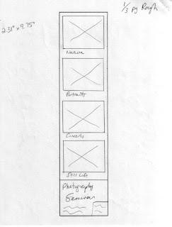
Live Area: 2.31” by 9.75”
(non-bleed ads should allow for 1/8” grind-off)

After determining the dimensions of my ads, I gave some thought to what kind of ad I would create. I decided to go with an advertisement for a photography seminar. My target audience would be people who want to learn more about their particular "niche" or their area of expertise in the widely diverse world of photography.

The call to action for my ad campaign would be for the reader to want to learn more about the seminar and either call the phone number listed or visit the website for more information, and eventually register for the event.

After deciding on all of those specifics, I started the brainstorming process, aka thumbnails and rough sketches. The following are scans of the same:


Thumbnail sketches for the Full-Page Ad


Thumbnail sketches for the 1/3-Page Ad


Rough sketch of the Full-Page Ad


Rough sketch of the 1/3-Page Ad


Final Full-Page Ad


Final 1/3-Page Ad

Thursday, November 18, 2010

The Best Free WordPress Themes of 2010

Just thought I'd share. There are some really groovy ones on the list that I may try out, and you should, too!

The Best Free WordPress Themes of 2010

Until next time...

Wednesday, November 17, 2010

HDR Photos

These are two photos I shot in 2007. While looking through the archives tonight, I decided to see what I could do with these two bland-looking shots with potential because of the composition.

Here are the results:

Shot #1 - Before


Shot #1 - After


Shot #2 - Before


Shot #2 - After


More to come, as I'm thinking of doing a series with these.

Monday, November 15, 2010

Direct Mail Piece with Variable Data Project

Our next assignment was to create a direct mail piece that would incorporate variable data. The idea was to create two different versions of the same advertisement to send to two different target audiences. The size of the final piece was to be 8 inches by 5 inches.

I decided to create something to advertise my own photography. Further to that, I chose two audiences that I've actually served in the past. They are 1) bands and musicians and 2) people with children.

The call to action, or the intended purpose of this piece was to do the following:

1) Catch the viewer's attention and get them interested in finding out what kmh photography is all about;
2) Visit the Facebook page and become a fan;
3) Visit the official website for more samples of the products and services offered;
4) Email for more information or set up an appointment for a shoot.

The following are some images of my brainstorming process:


Thumbnails - Front; Band Version


Thumbnails - Front; Child Version


Thumbnails - Back; Both Versions


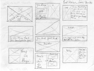
Rough Sketch - Front


Rough Sketch - Back


After a series of changes in how I'd lay it all out,
here is the final product:

Front - Band


Back - Band


Front - Child


Back - Child

Emerging Media Presentation at FSRTC

I took away a lot of extremely useful information from Joe Grigsby's presentation on emerging media last week. He shared so many useful pieces of information that I couldn't write fast enough to keep up with him. Here are some great bits I took away from the seminar:

Emerging media is defined as the consumer behavior trends that transform how the consumer connects to content, each other, and a broader society. There are two main media trends today, and they are social and mobile.

Media consumption continues to shift to digital. This is something we all know, but what may be less widely known is that 66% of all media consumption today is digital, and, by 2020, that number will be 80%. 76% of broadband users are active contributors to social media and are active content creators, and this will continue to increase with each generation.

Something else I found interesting and hadn't really thought of before is that 92% of all two-year-olds in the U.S. have some kind of online persona due to their parents or families posting photos of them online.

If Facebook's 500 million users made up one country, it would be third in the list of the largest in the world, just behind China and India. Facebook is slowly taking over Google as internet users' starting point. The difference between Google and Facebook as far as social media goes is that Google represents the consuming part of the interaction, and Facebook is where the contributions to online society take place.

Further to social media, as far as companies and brands are concerned, they don't always have control over their reputation. Because consumers trust other consumers twice as much as they trust marketers, word of mouth is far more effective today than it was even ten years ago. Brands can suffer badly if even one person has a bad experience with their product, and that one person tells all of their friends. However, that can go both ways. If a consumer really likes a certain brand or product, they will tell their friends about that, as well, and the brand's reputation can skyrocket overnight.

Another interesting piece of information is that marketing equals reach and influence. In the online world, social media has the reach, and your friends have the influence.

Thanks to Google blogs, Twitter, Yahoo! Answers, and many other sites, marketers have the opportunity to "listen in" on these conversations about their products and get invaluable feedback about what people like and don't like. It is also a good opportunity to put out any fires if someone is talking about their bad experiences with the brand.

The possibilities and opportunities that social media presents are limitless; however, it is also time-consuming. Companies must maintain that relationship with the consumers. They can't just set up a Twitter account and never update it, and the same goes for Facebook pages and the like. If consumers never see updates on these pages, they will get bored and move on to the next new thing.

While listening in on these conversations, over time, marketers can figure out what is relevant to specific groups of people. This type of information is quite useful for direct mail and targeting specific audiences. Rather than sending something about golf to someone who couldn't possibly care less about it, the company can find out what they are interested in and send them something relevant to their interests.

Another important part of utilizing this information obtained from listening to consumers' conversations is integrating it into their day-to-day lives. For instance, you can link your Facebook account to another website you log into on a regular basis. That way, if you don't happen to visit a certain brand's website everyday, you're definitely more likely to log into Facebook quite regularly.

Social media is also useful in the search for employment. A website called Simply Hired integrates Facebook into their site and you can see which friends are in which fields if they have signed up for an account. When you see your friends "liking" things, you are likely to check it out, as well.

Activation is another important part of using the information. Running ads on Facebook is a great way to get your brand name out there. You can also target groups of people with specific interests listed in their profiles and avoid sending them information that does not pertain to them.

Accessing media with a mobile phone is growing very quickly, as well. With mobile phones, you are always connected to your social media site of choice. Socializing via text messaging is the most popular means of communication among 12 to 17-year-old girls. Texting surpassed email and phone calls with this particular age group.

Twitter is a popular site with mobile users. 84% of Twitter users access their account via their mobile phone, and 30% of Facebook users log on through their phones.

By 2020, accessing the internet via mobile media will surpass the use of desktop computers. Tablet computers, such as the iPad, will actually outsell desktops and laptops by 2015.

It is important to understand your target audience and what devices they use and how much they use them. The objective is to make them want to add your company as an "app" on their phone. What makes your brand stand out amongst the thousands of other apps for Smartphones?

Using text messaging is an effective means of reaching consumers. You can give users the option to sign up for alerts, coupons, surveys, and sweepstakes via text messaging.

In the past, physical media and digital media have been in two completely separate worlds. With the growing use of social media, the consumer will see a physical ad in a store or on the street, or wherever they may be and then head home to log on to the Internet for more digital information about the product. This combines the two worlds of physical and digital media.

After his presentation, Joe answered a few questions. One of them was how his company surveys consumers to find out their wants and needs. He said they use two methods: primary research and secondary research. Primary research is direct feedback from consumers, listening in on forum conversations, and focus groups. Secondary research is the consulting of companies of experts on different types of products.

Another question was how his company measures success. Joe said that they measure the success of their endeavors by the size of the span of their reach and influence. The four main steps to get from reach to influence are 1) awareness, make the consumers aware of your company's presence; 2) influence, tell them why they should choose your company; 3) reach, persuading them to try your product; and 4) conversion, making them a new loyal customer of your product.

One of the most important things I took away from the presentation is that we should not focus on the "what" of marketing, but the "why." In other words, the "what" represents the present technology and method of marketing, and the "why" is the obtaining of the consumer relationships and knowing your target audience. I also heard this in Brendan Murphy's symposium: technology is and always will be changing on a day-to-day basis. We should be familiar with it but should not let that be the most important aspect of marketing ourselves to potential customers. How we market today, be it via Facebook or other online means, will not be the same in even five years from now. We need to adapt our "whys" to each type of new emerging media.

Thursday, November 4, 2010

Photography Cheat Sheets

Thanks to one of my friends on Twitter, I've been made privy to a pretty sweet collection of some photography cheat sheets. I know I will be using a couple of them for reference.

13 Super Useful Photography Cheat Sheets

When I have a chance to create a Links list, I'll include this one for your convenience.

Until next time...

Tuesday, October 26, 2010

Collegio Ad Project

Our third project in Digital File Prep was to come up with an ad that would be something that could be printed in The Collegio, PSU's school newspaper. I decided to make an ad for my dream coffee house that Pittsburg so desperately needs.

My target audience is pretty wide and includes college students, coffee lovers, Pittsburg area residents, and people who are looking for a place to relax with a good book or conversation. This coffee house would serve many different social classes within the Pittsburg community, since coffee and related drinks are not expensive high-end products.

The "call to action" of my ad was to entice the viewer to come into the coffee shop and want to become a fan on the official Java Bean Facebook page. By "liking" the page, customers can keep up with what is happening The Java Bean, such as daily specials, discounts, and the live music event calendar.

Below is the creative process that led me to the final product:


Word Matrix/Brainstorm


Thumbnail Sketches


Rough Sketch


Final Ad


Our budget on this project was $100.00. The rate quoted was $4 per column inch.

My design measured 5.75 inches x 6 inches, which translates to 3 inches x 6 inches in column-inch dimensions. (5.75 actual inches = 3 column inches)

To calculate the total cost of the ad, I multiplied the 3-column inch width by the 6-inch height, which came to 18 column inches. I then multiplied that total by $4, which brought the total ad price to $72.00, which was well below the $100.00 budget.

Monday, October 18, 2010

Brendan Murphy Symposium

On Friday, our class had the opportunity to attend a symposium with Brendan Murphy, who is a graduate of the GIT department of PSU and now works for the Lippincott branding firm in NYC. He had lots of interesting information to share.

One thing that stood out to me was that a huge part of designing is writing. He said that he spends 75% of his time writing, 5-10% drawing, and the rest of it in training for different projects. He also said that he is eternally grateful to his tech writing instructor. I don't think Dr. Hermansson was there, but I'm sure she would have appreciated that comment. Not that I
don't always pay attention in tech writing, but I will most definitely save my notes from the class for future use. I will appreciate more the writing assignments for Digital File Prep., as well.

One of Brendan's early and most important projects was his redesign of the universal symbol for handicapped people. He designed it so that the wheelchair was not representative of the person, but rather the person is more independent of the chair. I think it was a brilliant idea, and, apparently, so did a lot of companies such as Walmart, who adopted the symbol for their stores.

Another thing that stood out to me was when Brendan said that the following line can sum up the process they use for designing: "Nowhere leads to somewhere." That inspired me because I dread a blank slate at times. Sometimes I feel like I don't have a wall off of which I can push myself and gain some momentum, but this simple line gave me some hope that something can come out of nothing.

Brendan also said that we should "never fall in love with the technology because it's always changing." I'd never stopped to think of that before, but it's true. Today, we have Adobe products, computers, and a plethora of other instruments to help us in the designing process. However, in the future, the way that we go about the art will be different. We need to hold on to the core principles of design so that we can succeed, no matter what medium we are using.

Among Brendan's interesting tidbits was the fact that places like McDonald's and Cinnabon use "pumped-in smells" to attract customers. I always smell the fries when I pass by McDonald's, but I never stopped to think that they could be exaggerating the smell for my sake.

Brendan also told us that some companies are in the process of creating scents for companies along with the visual and verbal elements of brand identity. I'm anxious to see how that type of concept will be implemented.

One statistic that he mentioned when asked was that he has had scenarios where they created anywhere from 300 to 3,000 thumbnails for one logo project. Sometimes it takes that long before coming across the right one. To a student just getting started and learning the ropes of design, that's quite an overwhelming concept.

Another great piece of advice he imparted to us was to read as much as possible outside of our own specific disciplines and to realize that general education courses are just as important as our major classes because they help us to be well-rounded and give us the ability to relate situations all over the board to our own areas of expertise.

One of the final things he told us is what makes a company a good company is how much you invest into it. I'm sure he meant not only financial, but also physical, mental, and emotional. The time spent on a project will most definitely show in the final results.

*Brendan Murphy photo source: funxionology blog.

Thursday, October 14, 2010

Gap Logo Redesign


Photo credit: Vanity Fair.


I personally think that the whole Gap logo ordeal has been taken far past the realms of where it should have been; however, it really is to be expected because when one person gets outraged about something in the news, it seems to be contagious. Someone reads the online comments of this angry person and agrees with them, and it blows up into something quite ridiculous. However, that's not the focus here.

I believe The Gap was justified in trying to freshen up their brand identity a bit after sales fell; however, it shouldn't have been so drastic. It would have been a better idea to go with something similar to the old logo, just spiced up a bit. Something completely unrecognizable and unfamiliar was just an all-around bad choice, considering how most people don't like change and take comfort in all things familiar.

The new logo choice was very simple, not necessarily a bad design, just really pointless. Unless they were trying to send a message about The Gap simplifying things, it honestly did nothing other than prompt me to "borrow" the idea and insert my name there instead for some Illustrator practice. It's actually been fun and may have started a narcissistic hobby.

But, again, I digress.

I can understand the choice of Helvetica because it's pleasing to the eye. It is pretty much everywhere and has proven itself to be effective, though slowly becoming the new Comic Sans. However, The Gap has always been a little classier than just an everyday clothing store. Their prices are higher than other stores, and I, personally, haven't really ever shopped there for that reason. Perhaps they are trying to make people think that they are becoming more affordable and decided to incorporate an everyday-type logo.

The addition of the square to the end of the word was a strange, yet simple choice. They could have used a more interesting shape, but if simplicity is what they were after, then the square was appropriate.

Of course, along with a complete overhaul of brand identity comes a huge financial cost. They'd have to replace tons of things such as signs, banners, redesigning of websites, fliers, and lots more. Whereas, if they were to incorporate a newer, yet still familiar logo along with the old one, it wouldn't cost quite as much because the new logo wouldn't have to be absolutely everywhere right away. In order to keep your brand identity fresh and to keep attracting new customers while keeping the current ones satisfied, cost will always be involved; however, it can be kept to a minimum if the campaign is done right.

Perhaps now The Gap should work on something more familiar to their loyal customer base, yet still a fresh idea that will attract new shoppers. I'm personally glad they scrapped the logo, though. I was afraid that World War III was about to erupt. Over a logo.

Notepad Project Synopsis

Word Matrix


Thumbnails


Rough Sketch


Final Printed Proof


Because the final product was going to be a notepad, I needed to use as much white space as possible (for the functional part) while still making it appealing to the audience. At first, I somewhat cluttered up the page with borders and graphics. After the critique, I realized that I didn't need all that much going on for it to be effective. I removed one of the graphics and the unnecessary borders around the words, and the layout was a lot cleaner.

I also gave my design some direction in my choice of graphics. I edited one of my concert photos in Photoshop in which the guitarist was pointing his guitar in the air and made it into a plain black and white image that almost looked like a vector drawing. I placed it right beneath and to the left of the wording across the top of the page so that the guitar was pointing to the words and would lead the viewer's eye to them.

I chose the guitarist graphic and rock theme because I felt it would appeal to the majority of the intended audience, which were high school teenagers. I chose Skia font in small caps because it went well with the theme. The small caps also gave it some balance. I made "Rock Your Individuality" a little bigger than the rest of the text to gain a little bit more attention since the viewer would most likely already be looking for the PSU Graphics and Imaging Technology and website information. I wanted to be sure that the phrase across the bottom would be a little more dominant. I didn't use any gray or faded black tones because the stark black throughout went along with the rock theme as well.

All in all, it turned out to be a simple design, thanks to the critique. It served the purpose of a notepad because too much clutter on such a small page would make it a lot less appealing to the target audience or to anyone, for that matter.

Monday, April 19, 2010

Welcome!

Hello, and thanks for visiting the kmh photography blog! This is where you can stay updated on what we're up to and any new projects we are working on.